introduction
Welcome to the eskar.co Corporate Visual Design Guidelines. These principles help you create consistent and distinctive designs that embody our spirit of courage, clarity, and forward-looking aesthetics.
Brand Statement
Be pure, daring, and identity-driven
Brand Claim
Shaping contrast, shaping future
Brand Values
Courage
The constant drive to push boundaries and challenge conventions.
Purity
Clarity and reduction define our design language.
Identity
Fashion as a personal statement, not mass conformity.
Progress
Constant evolution as the core of our vision.
Craft
Precision and respect for material in every detail.
Contrast
Black and white as our foundation and our attitude.
logo
The eskar identity is defined by two logo types: the symbol and the typography logo. Both are used independently and may never be combined.
Examples:
Logo symbol
Typography logo
Logo symbol inverted
Typography logo inverted
Guidelines
Do use
- • Use either the symbol or the typography logo, depending on context
- • Place logos in clear, balanced positions with enough space
- • Respect the protection zone around each logo
- • Keep logos minimal, without additional decoration
- • Choose black, white, or monochrome versions depending on background
Don't use
- • Don’t use the symbol and typography logo together
- • Don’t distort or recolor the logos
- • Don’t add effects (shadows, gradients, outlines)
- • Don’t stretch, rotate, or skew the logos
- • Don’t place logos on visually heavy or unclear backgrounds
Various formats for digital and print use: [eskar Logo Pack]
colors
Our brand is built on a minimalist black-and-white scheme for maximum clarity and elegance. Electric Blue acts as an accent color - a deliberate disruption, drawing focus and attention.
Black
Structure, Weight
#000000
White
Emptiness, Neutrality
#FFFFFF
Electric Blue
Disturbance, Attention
#0F2CFD
Light Grey
Softness, Space
#F2F2F2
Medium Grey
Balance, Neutral Tone
#CCCCCC
Dark Grey
Depth, Subtle Contrast
#4D4D4D
typography
The brand relies on Inter - a clear, modern typeface with balanced proportions. Designed for digital readability, Inter provides versatility across headlines, body text, and UI elements.
Font
Inter
Sizes
Heading 1
Inter 48 Light
Heading 2
Inter 36 Regular
Heading 3
Inter 24 Semibold
Heading 4
Inter 20 Medium
Heading 5
Inter 18 Medium
Heading 6
Inter 16 Semibold
Body text - This is an example of body copy. It is designed to be highly legible and pleasant to read. The typography follows modern standards to ensure clarity and precision.
Inter 16 Light
Inter Font Family Download
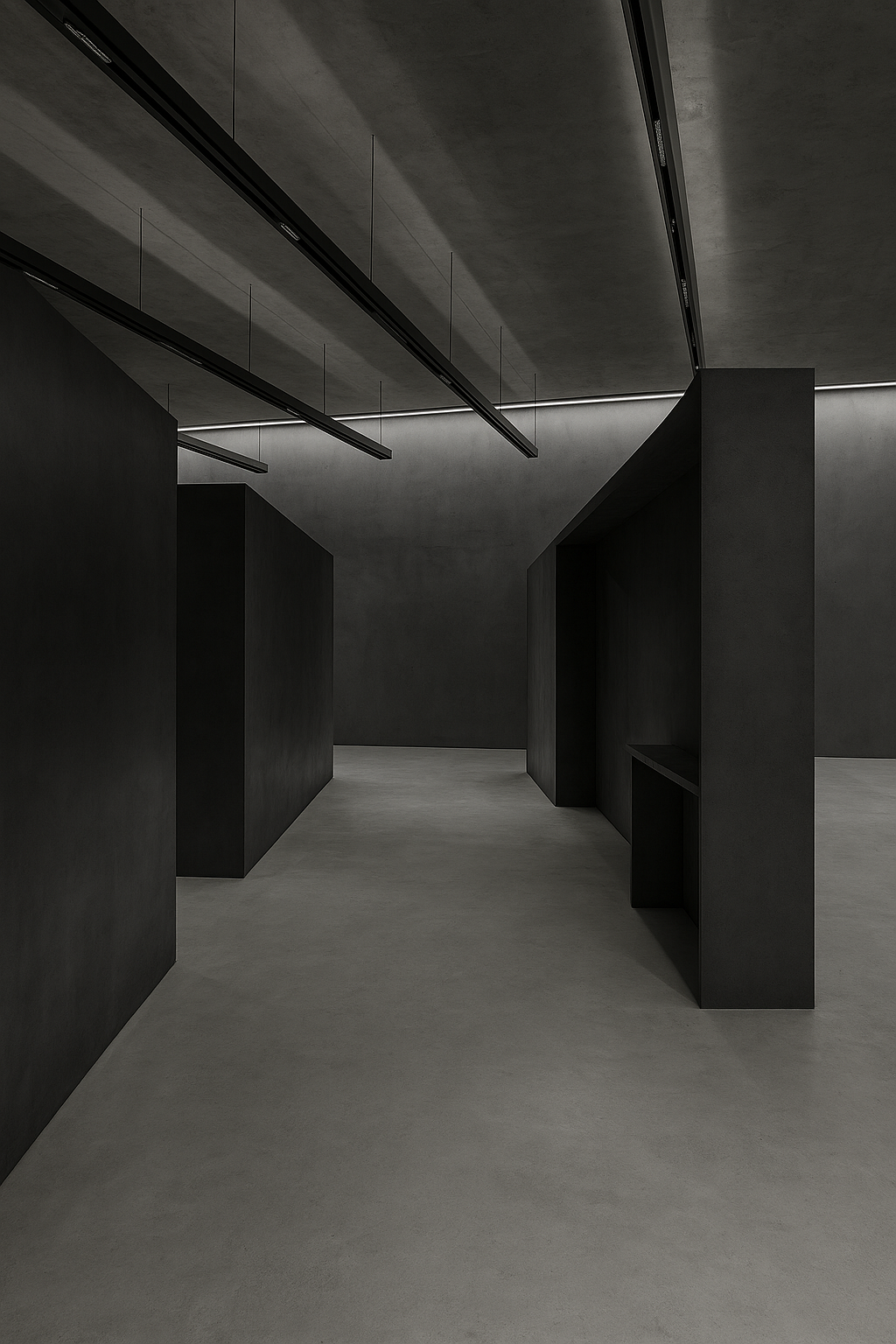
imagery
Our visual language draws inspiration from architecture, technology, and the raw contrasts of nature. Black and white define the foundation - clarity, depth, and timeless expression.
We harness the power of black photography, in architecture, nature, technology but also other abstract but aesthetical forms.


tone & voice
The eskar voice is clear, bold, and minimal. We use language the same way we design: reduced to the essential, but with strong presence.
Core principles
Clarity
Simple words, no overcomplication
Confidence
Self-assured, but never arrogant
Precision
Every word has weight and purpose
Modernity
Contemporary expressions, forward-looking tone
Contrast
Short, striking statements balanced with calm explanation
Do use
- • Short sentences, direct statements
- • Active voice over passive
- • Minimal adjectives, only where they add strength
- • English terms in global contexts, neutral expressions elsewhere
Don't use
- • Overly emotional or dramatic language
- • Complex jargon or technical overload
- • Playful, ironic, or slang-heavy tone
- • Excessive exclamation marks or filler words
applications
Examples of correct usage of the brand guidelines.
Business Cards
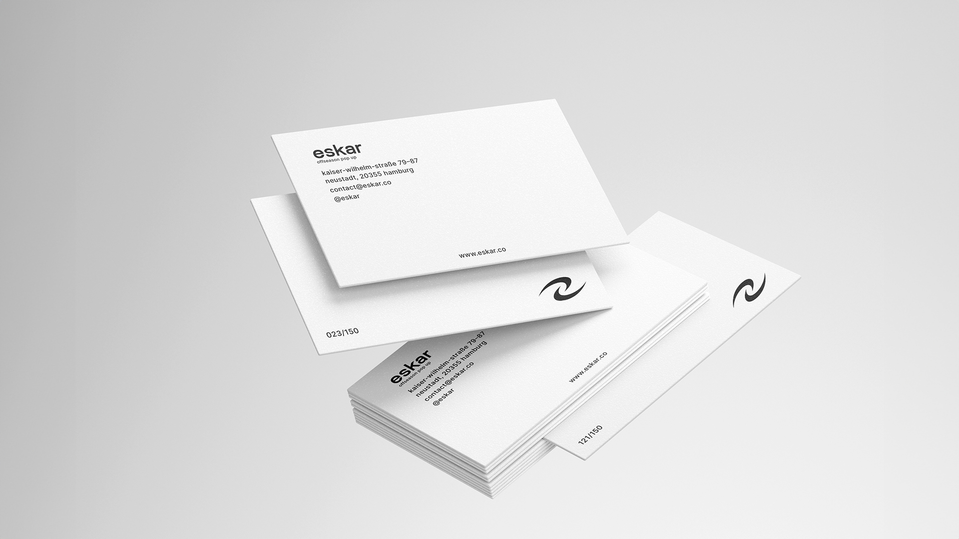
Minimalist design with logo focus
Website
Digital presence with brand consistency
Shopping Bag
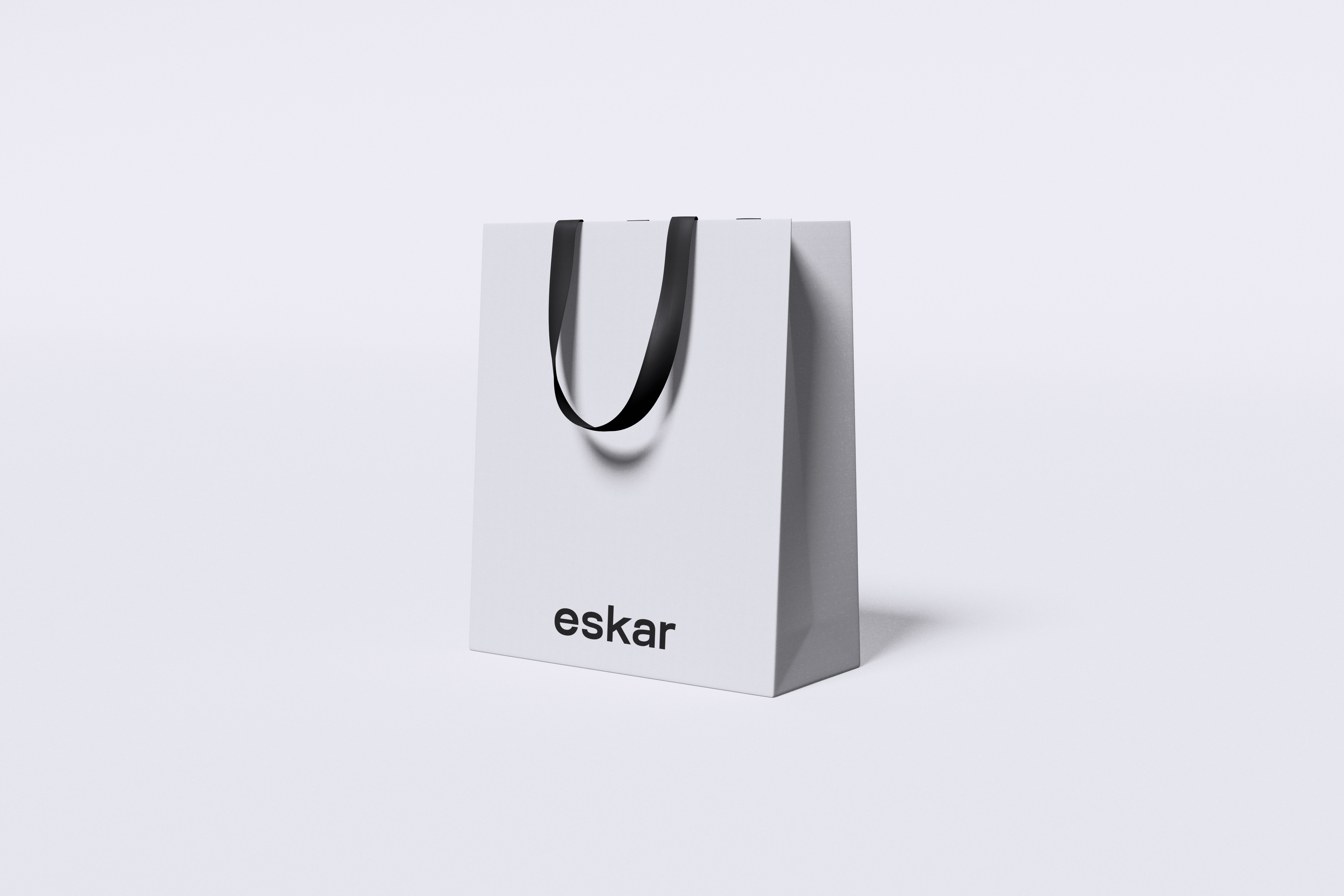
Clean packaging with brand identity
Label Tags
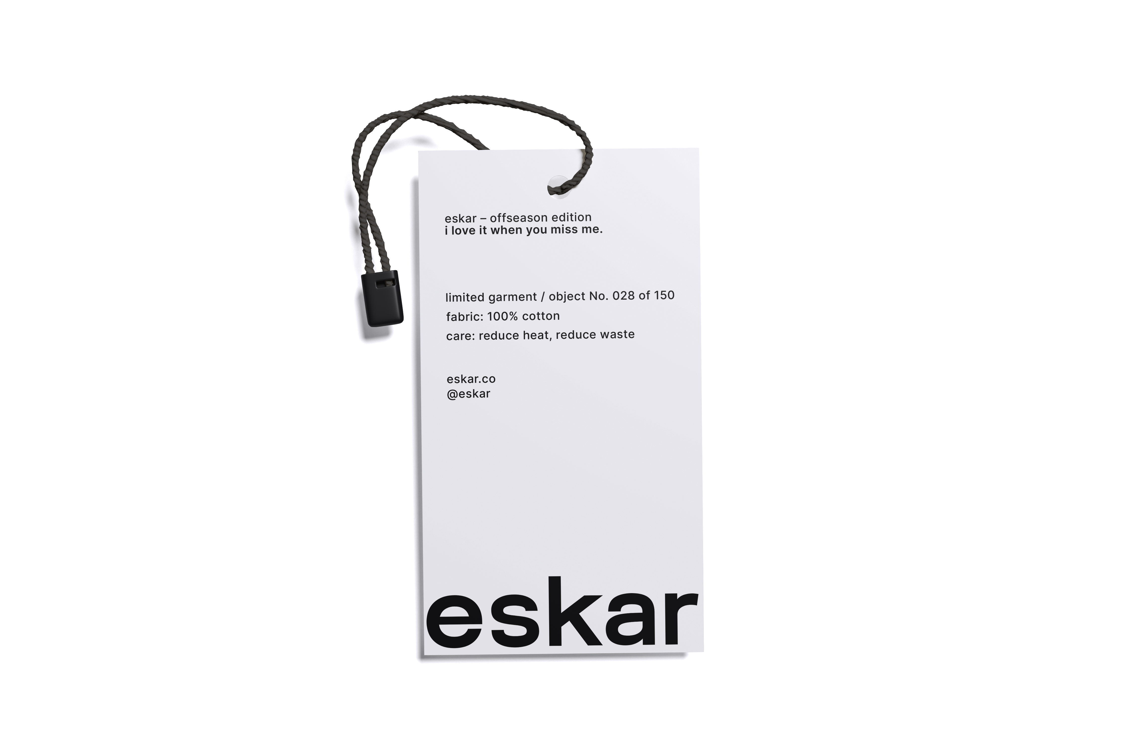
Product labeling with consistent branding
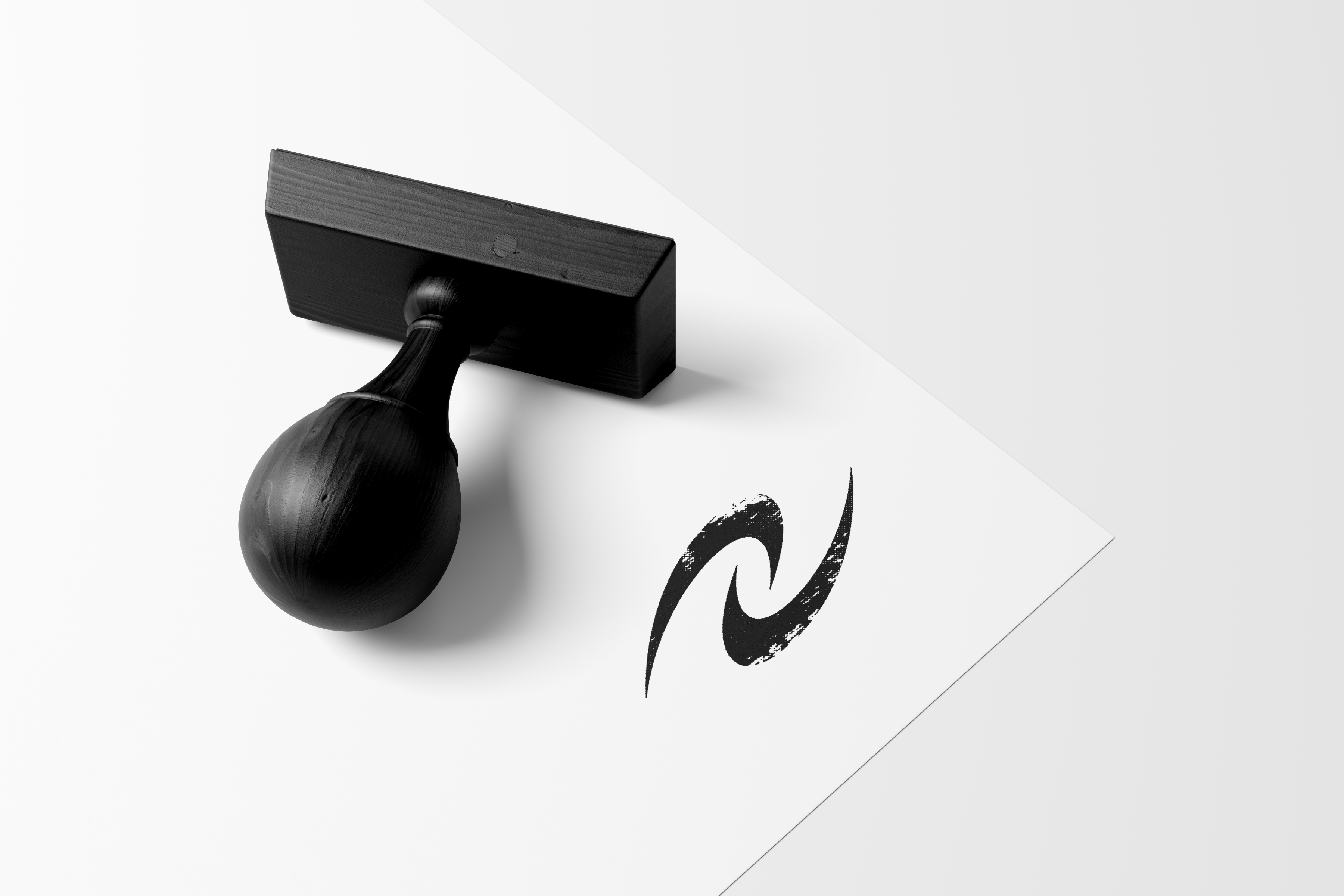
Stamp Design
Corporate stamp with logo integration
Print Applications
• Business cards and letterhead
• Brochures and flyers
• Presentation templates
• Packaging design
Digital Applications
• Website and web apps
• Social media profiles
• Email signatures
• Mobile applications
downloads
Download all necessary assets for your projects.